


A variety of logo designs for the food, fashion, charity, entertainment, retail and events sectors
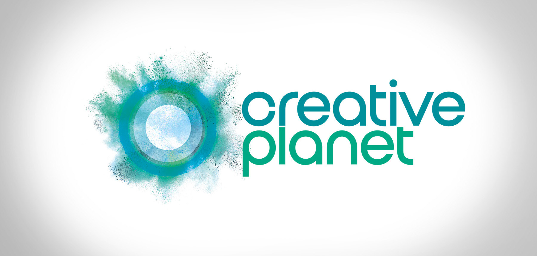
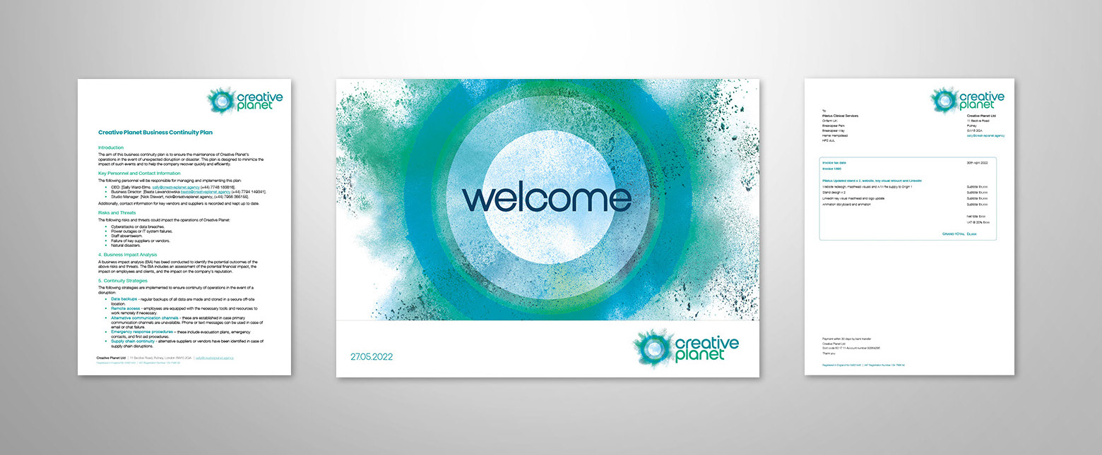
Logo and brand identity for Creative Planet – a London based marketing and communications agency supporting healthcare, charity, and well-being clients.

Reminiscent of a scout badge or patch, this logo uses a freeform brushstroke word-mark with simple icons. I also created T-shirts for the staff and a series of weatherproof PVC signage banners for the entrances to the two camping fields.
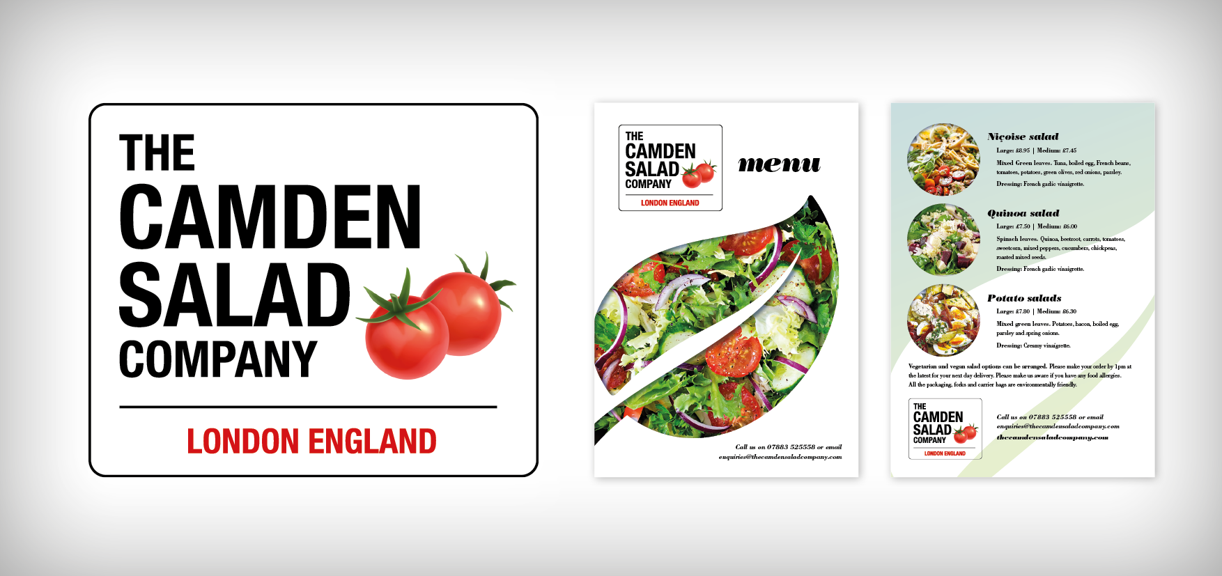
This fun logo echoes the London street signs and utilises the black, red and white colour scheme via the salad tomato images.
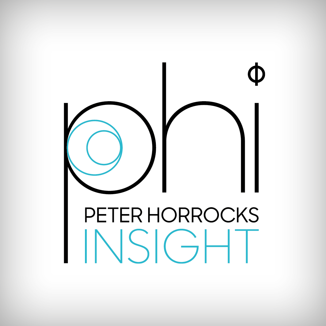
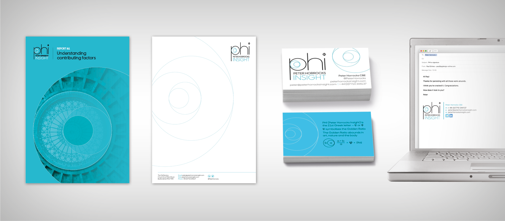
Brand identity for a business consultant, based on the golden ratio and the Greek letter PHI.
“Paul is an imaginative and painstaking designer. I asked Paul to design branding for my new one person consultancy. I was delighted with his work. I gave him an exacting but somewhat conceptual brief. He responded to the creative challenge with élan.
His branding has given my business style and class.”
His branding has given my business style and class.”
Peter Horrocks CBE
Chairman, SEMLEP (South East Midlands Local Enterprise Partnership). Former Vice-Chancellor Open University, Former Director BBC World Service
Chairman, SEMLEP (South East Midlands Local Enterprise Partnership). Former Vice-Chancellor Open University, Former Director BBC World Service
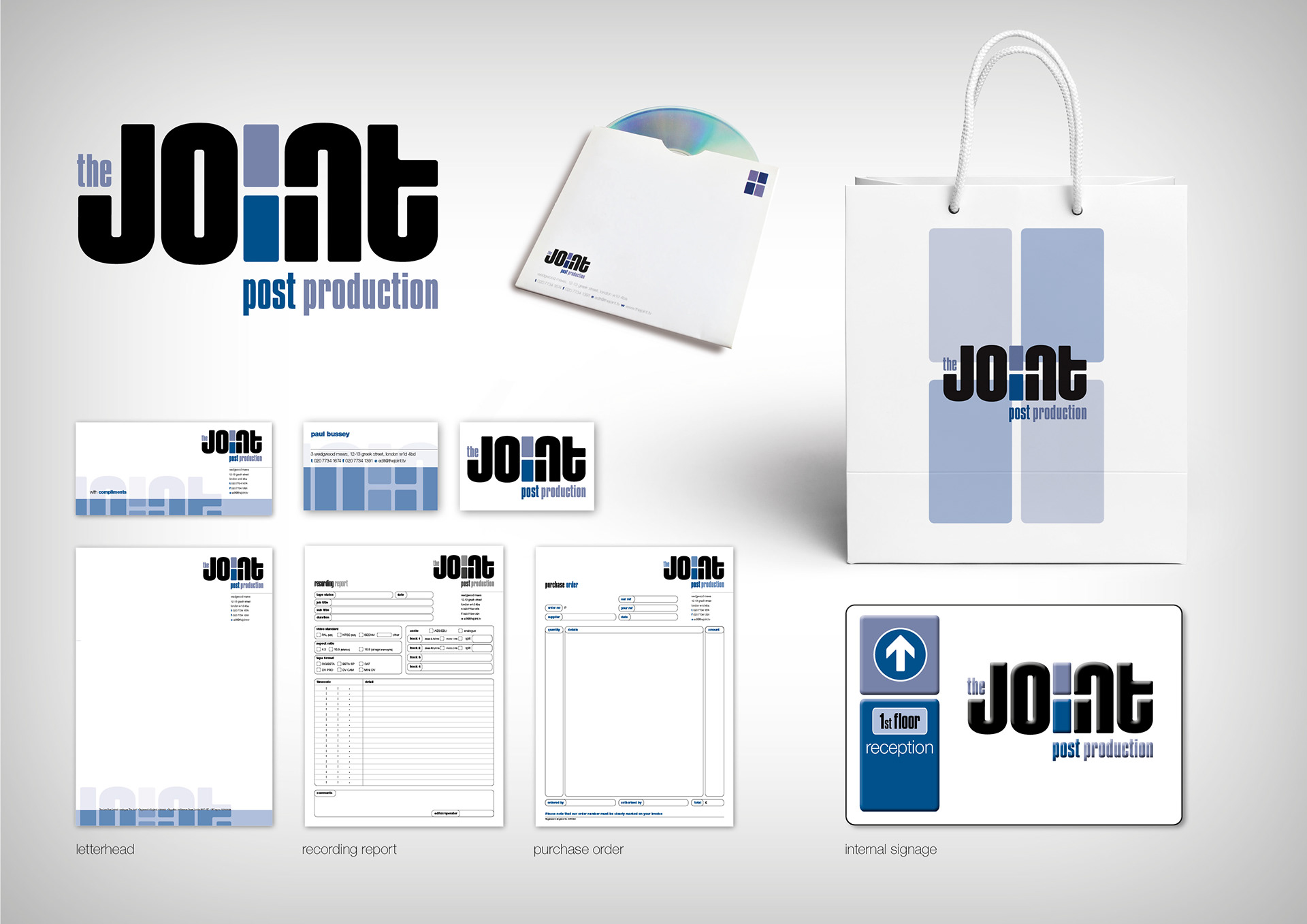
The Joint – award winning post production company in Soho, London – extensive campaign with a myriad of applications including identity manual, mousemats, signage, cab dockets, badges, tape labels, ads, Christmas cards and screen savers.
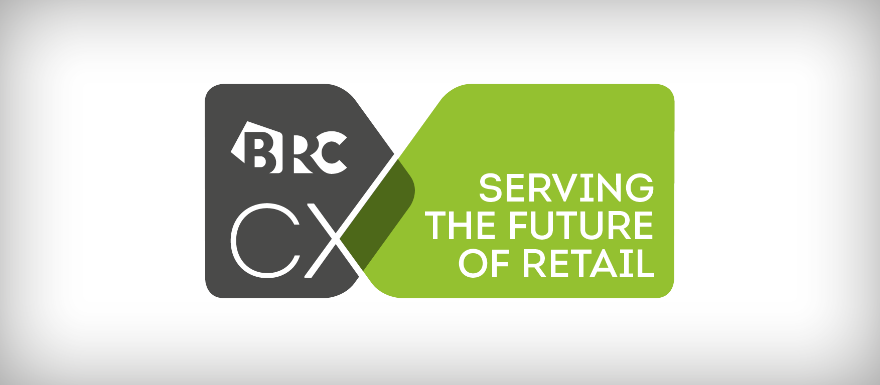
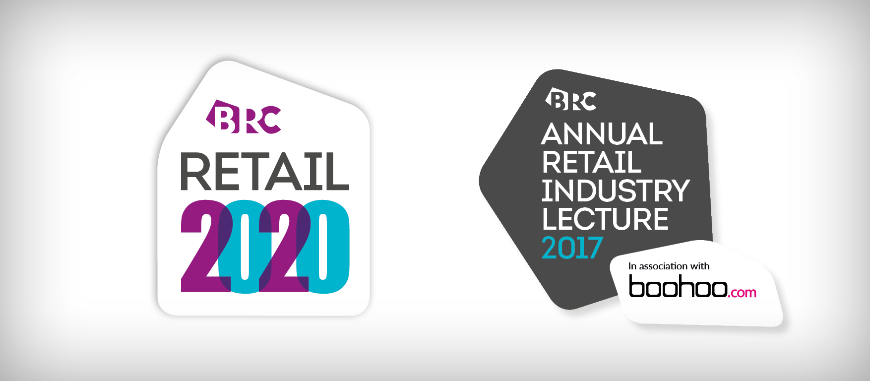
Above: I created a number of identities for the British Retail Consortium for events such as Retail Week CX, Retail 2020 as well as collateral such as event brochures, slides, banners and name badges. These projects followed some succesful design and branding for EMAP's Retail Week magazine and work on the the annual Retail Week Awards.
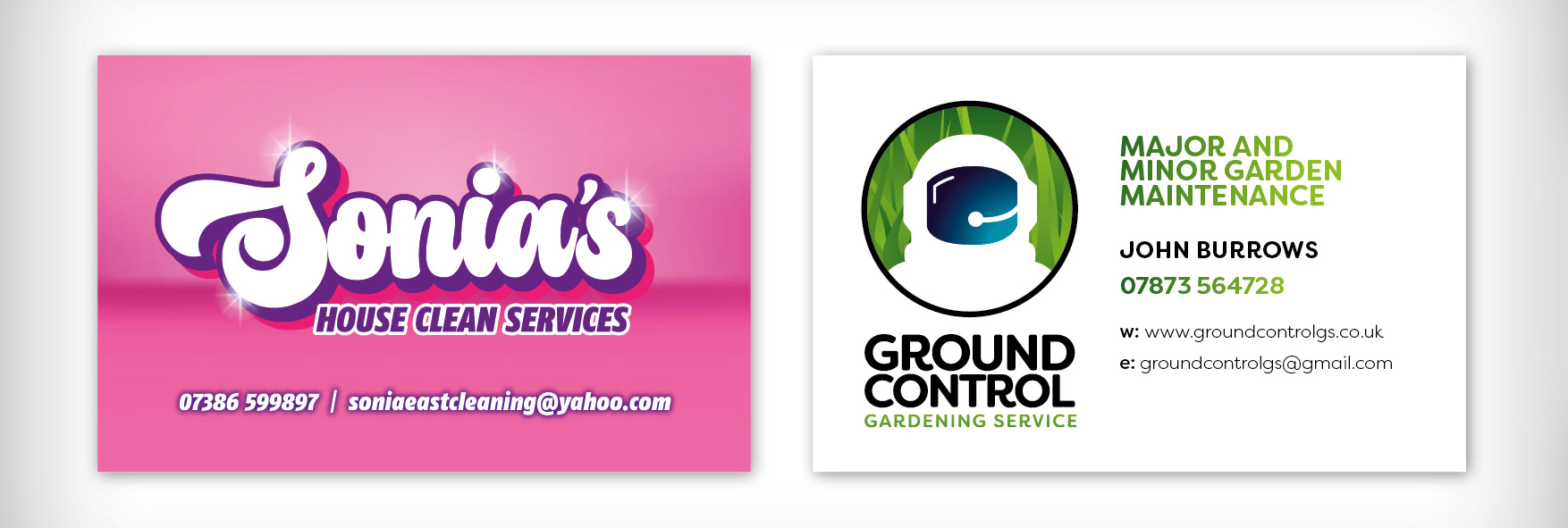
Above: Logos for small businesses: Sonia's House Clean and Ground Control – a gardening maintenance and clearance service
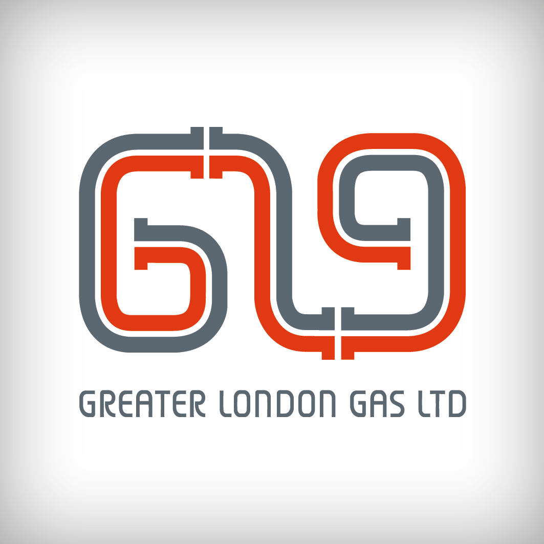

Above: Greater London Gas Ltd. are a small plumbing firm based in Uxbridge.
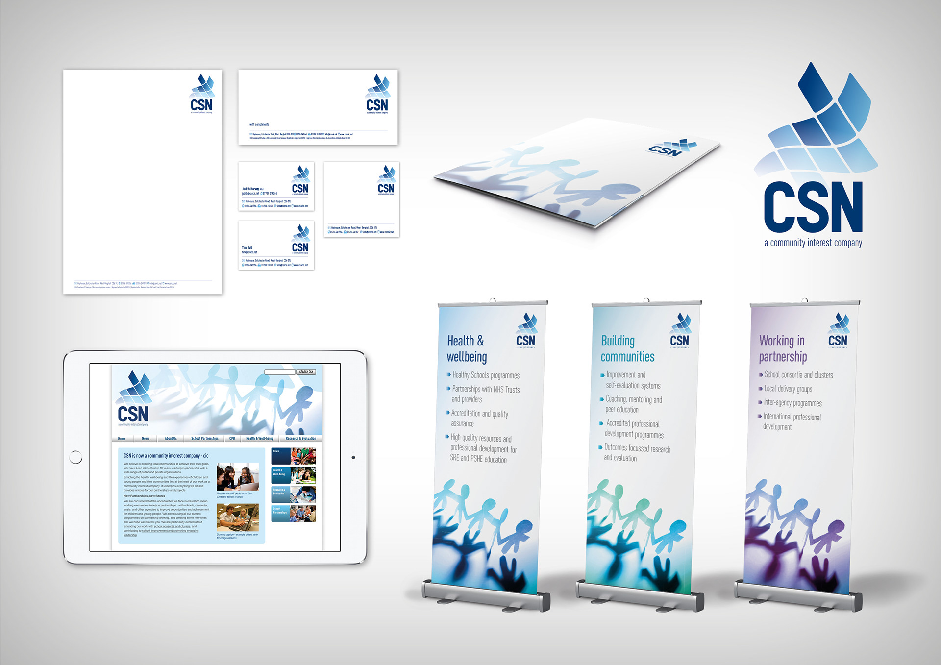
CSN CIC was a rebrand from CSN Consultancy Ltd, established in 1993. An education consultancy, working with secondary schools, they wanted to distance their brand from the 'consultancy' tag and direct it more towards communities. The new logo took on a more freeform look than the structured rigidity of the previous logo which was made from an ordered series of squares.
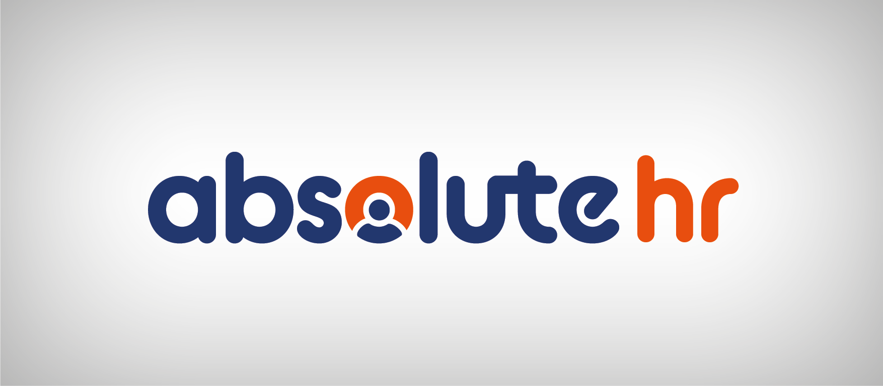
The brief for this human resources company was to create a professional logo reflecting the personality of the owner. The rounded typography and the human element in the letter 'O' adds a sense of fun, whilst remaining corporate enough for the HR sector.
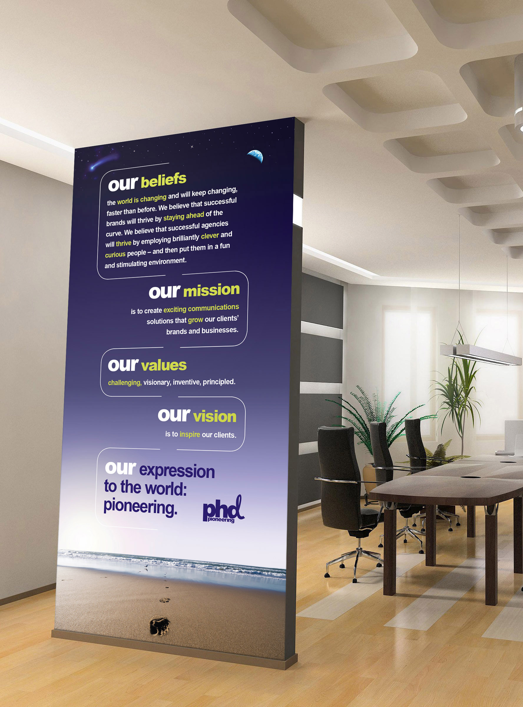


Global advertising agency PHD commissioned me to design a brand mantra for their UK HQ which would follow the brand guidelines whilst using type in a new and exciting way. It was later translated and installed in their French office.