
NHS & CQC Survey Infographic
Infographic designed for the NHS in partnership with the Care Quality Commission (CQC) and Picker Institute. This visual summary presents key survey results using the CQC brand style to ensure consistency and clarity across public communications.
Infographic designed for the NHS in partnership with the Care Quality Commission (CQC) and Picker Institute. This visual summary presents key survey results using the CQC brand style to ensure consistency and clarity across public communications.
Annual NHS & Picker Infographics
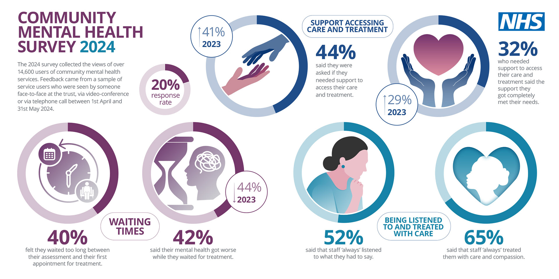
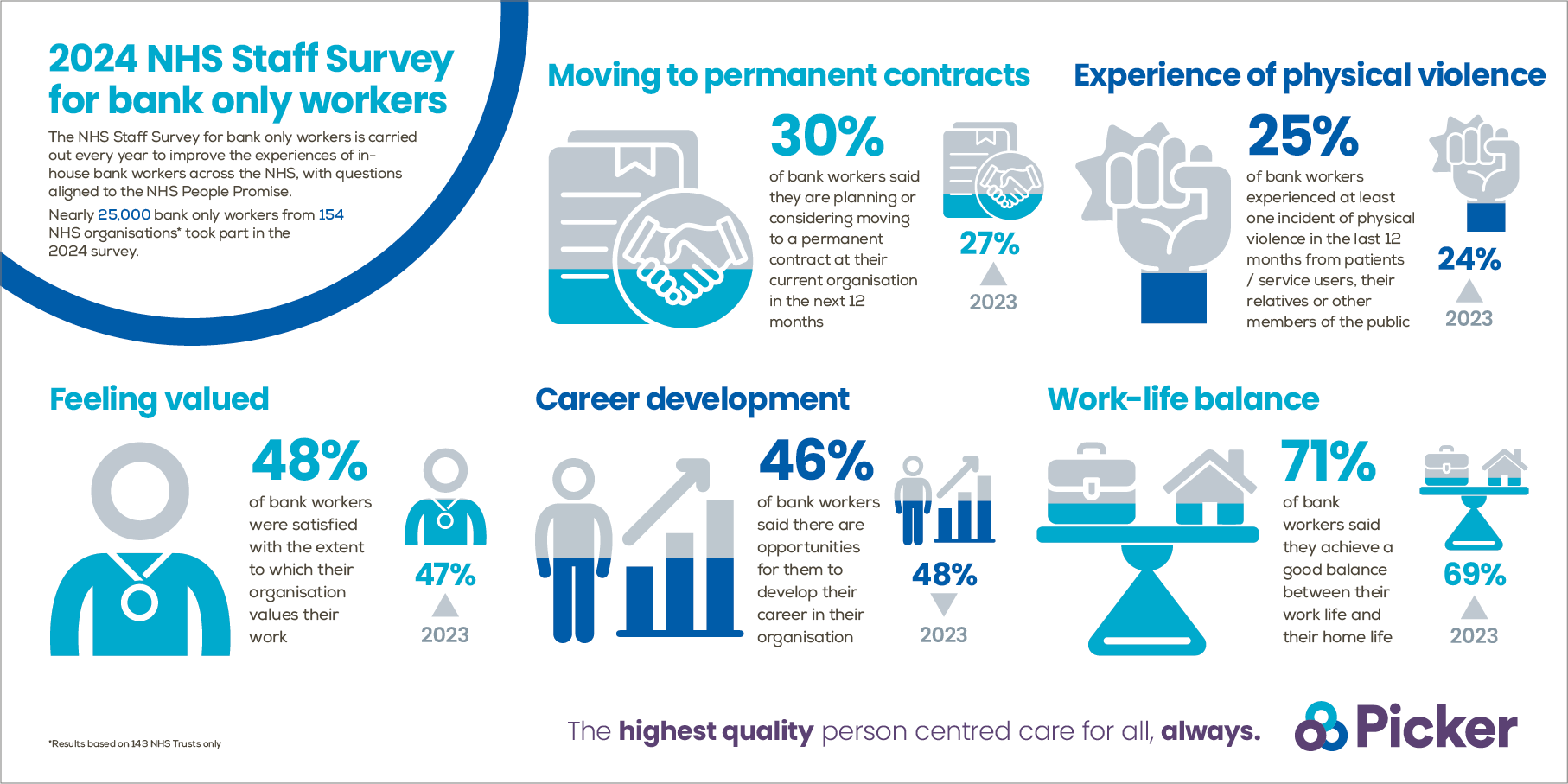
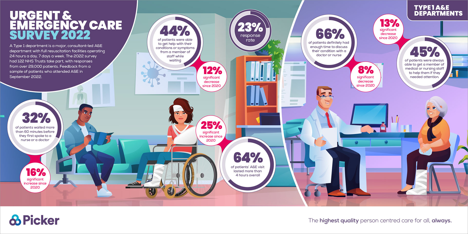
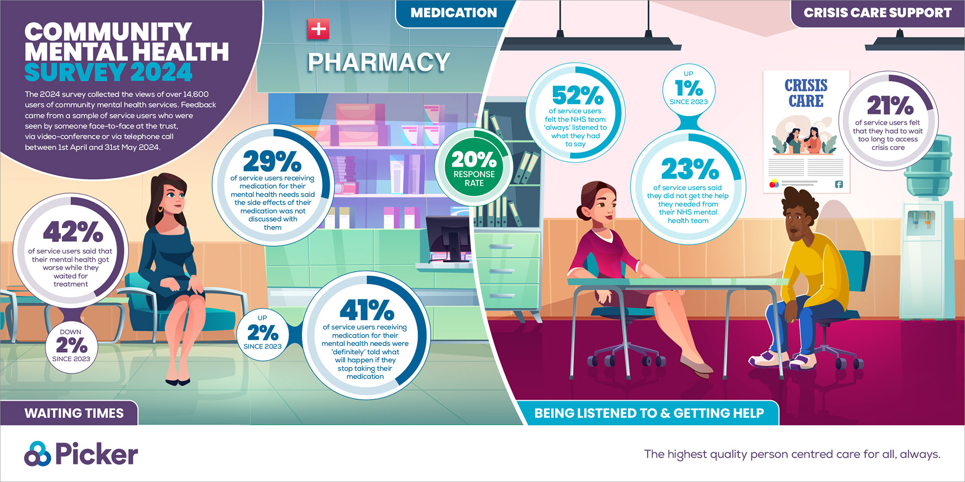
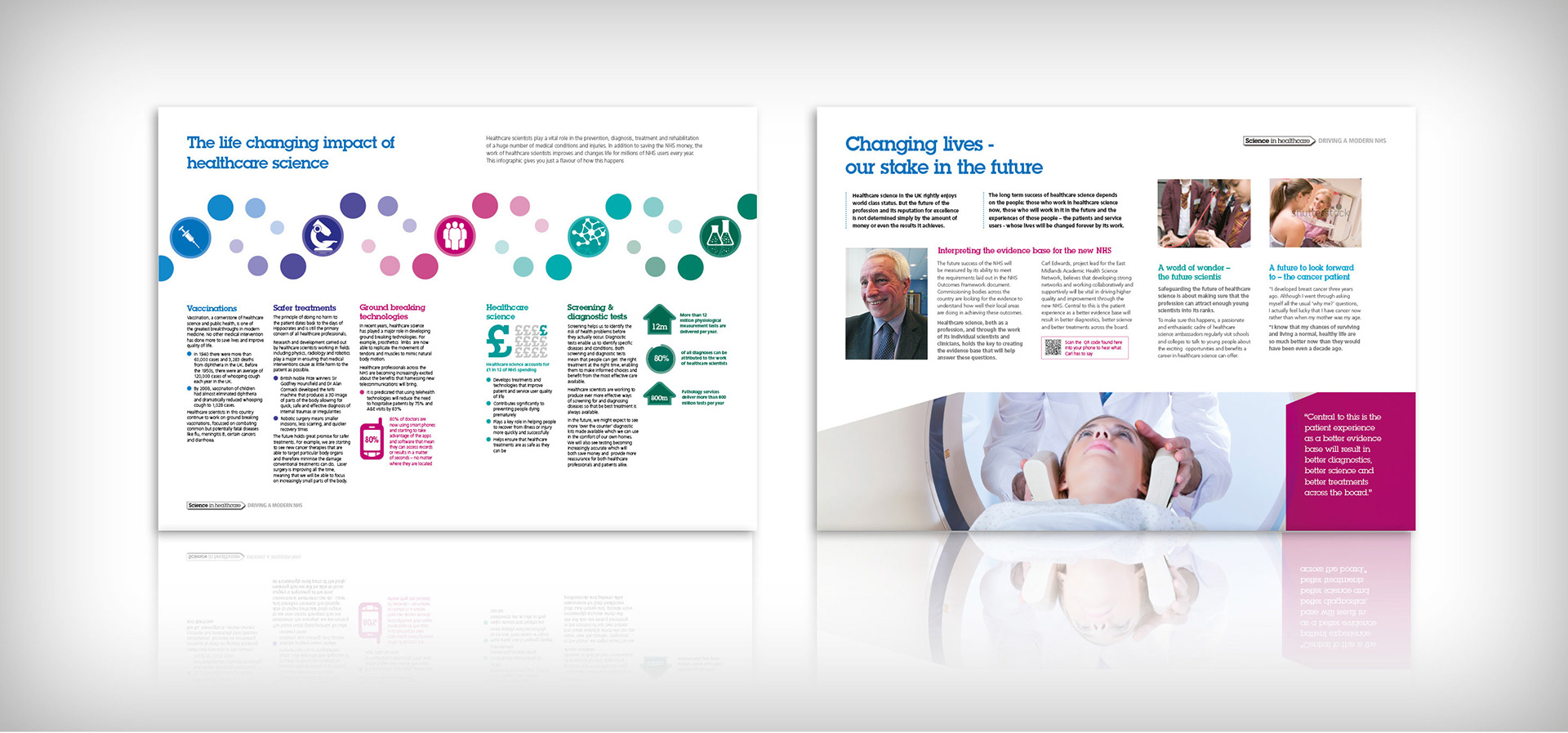
I produce a series of branded infographics annually for the NHS and Picker Institute, covering diverse areas such as Community Mental Health, Urgent & Emergency Care, National Staff Surveys, and Children & Young People. Each visual is tailored to the client’s brand guidelines to effectively communicate complex data to varied healthcare audiences.
I produce a series of branded infographics annually for the NHS and Picker Institute, covering diverse areas such as Community Mental Health, Urgent & Emergency Care, National Staff Surveys, and Children & Young People. Each visual is tailored to the client’s brand guidelines to effectively communicate complex data to varied healthcare audiences.
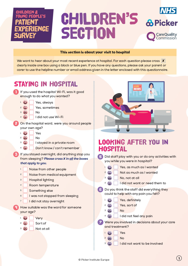
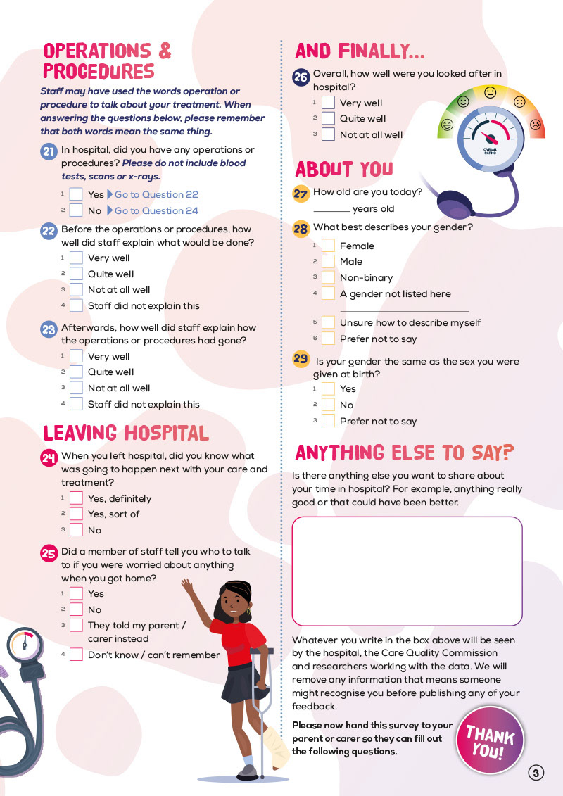
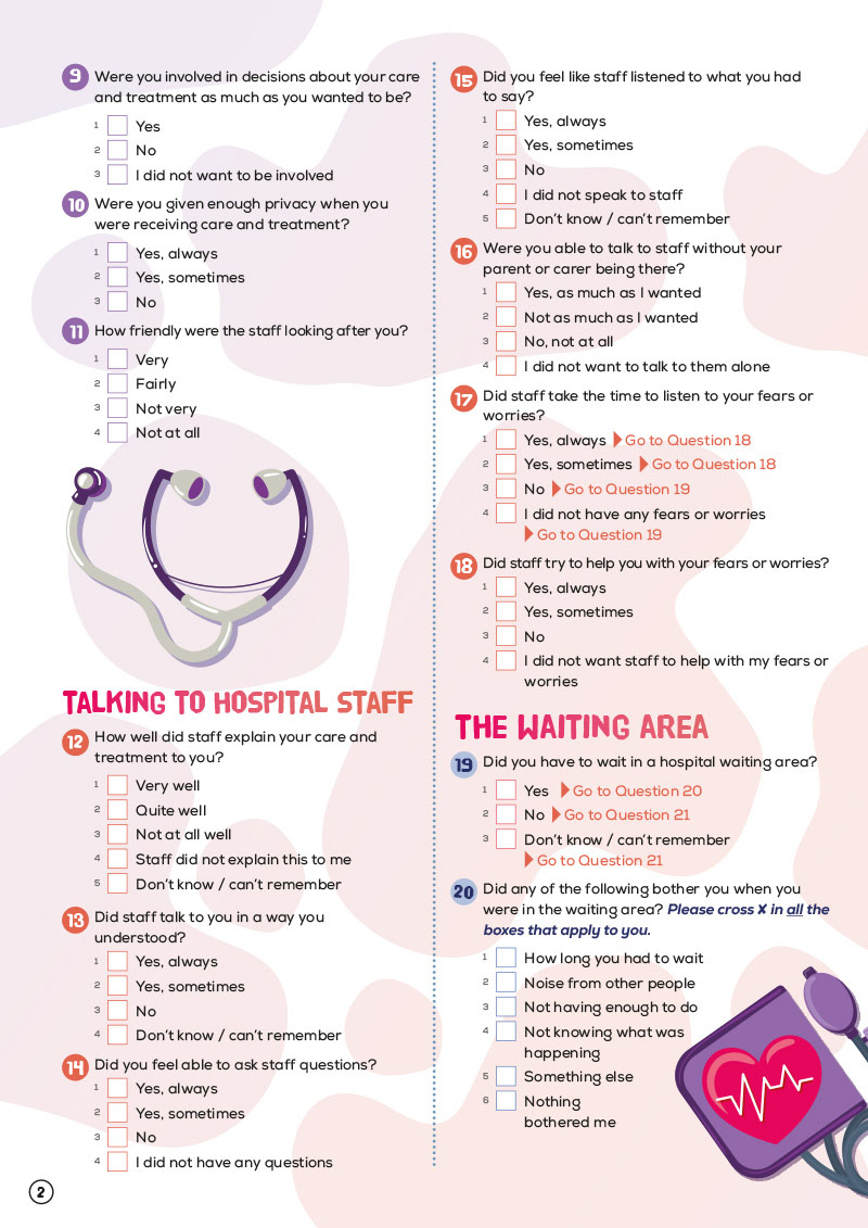
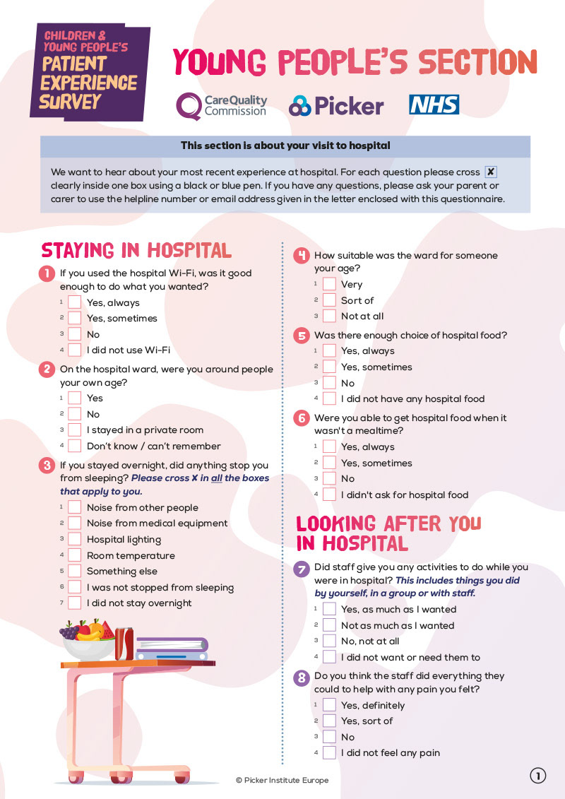
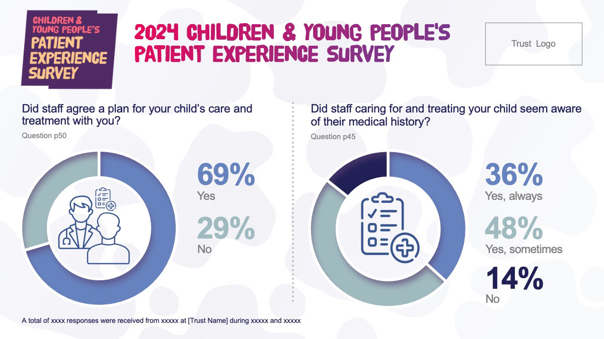
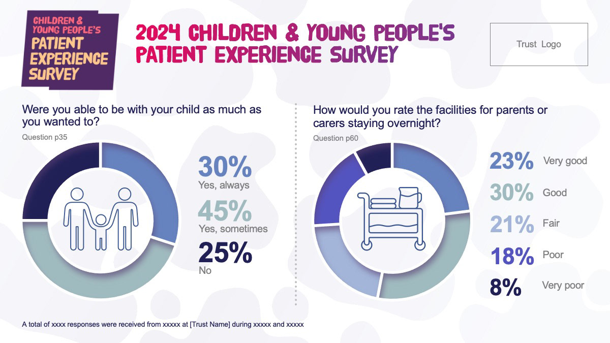
Children & Young People Patient Experience Surveys (NHS/CQC)
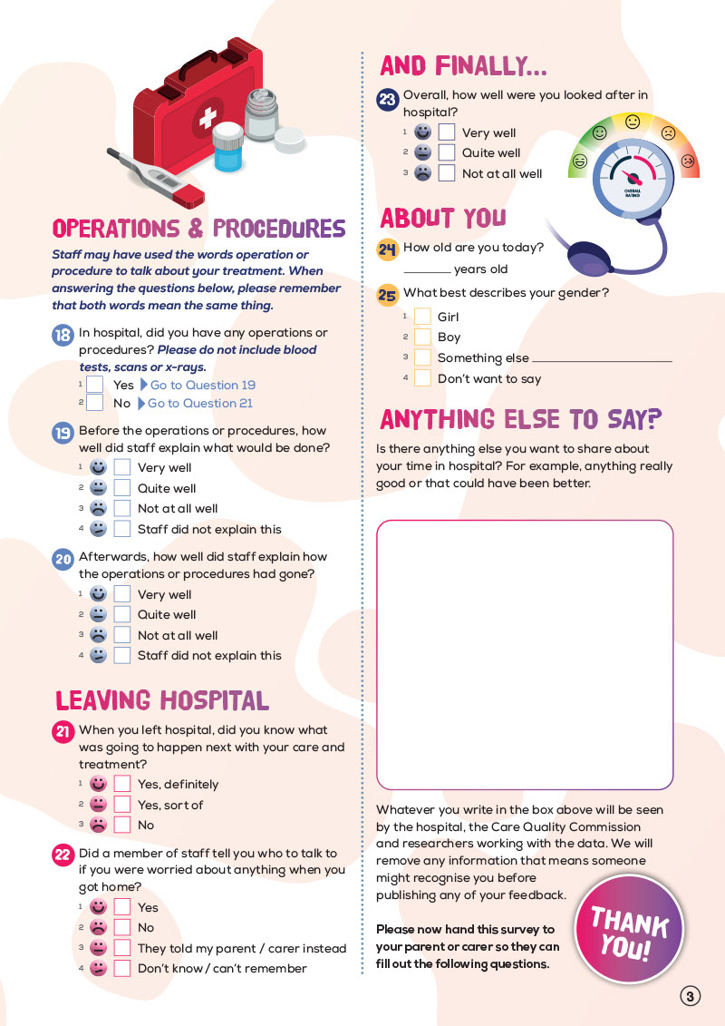
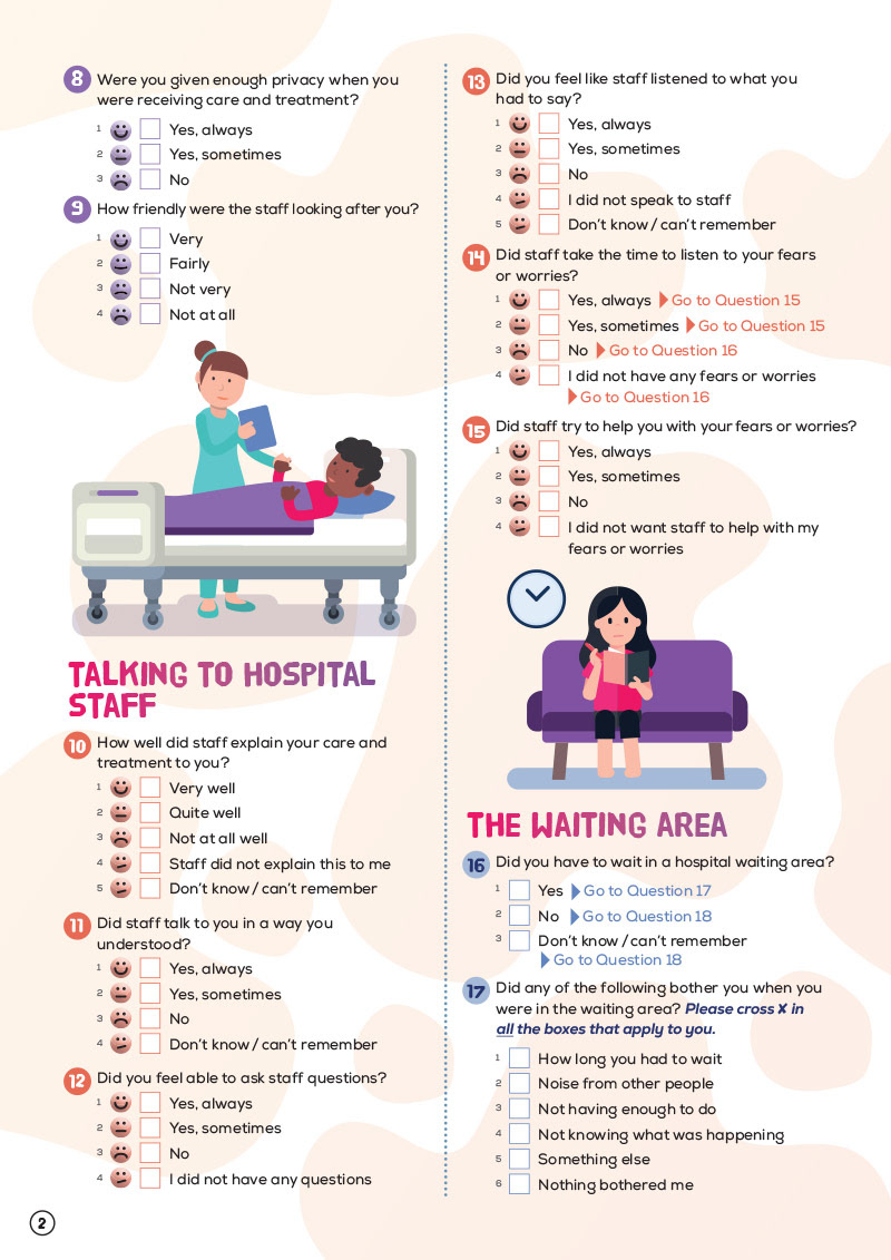
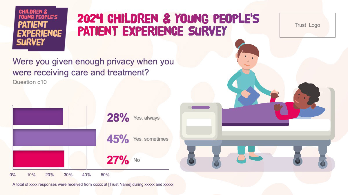
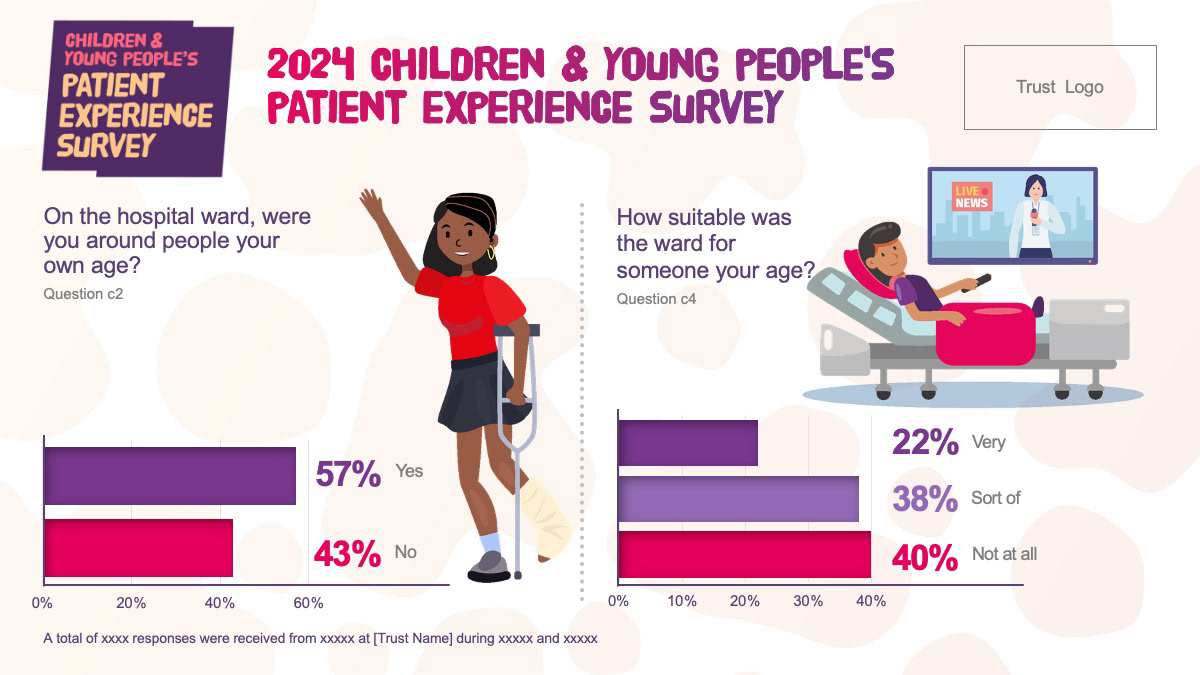
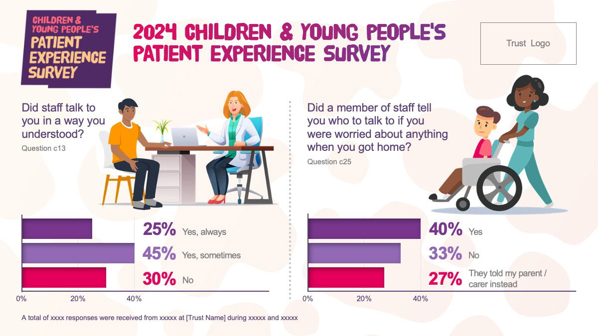
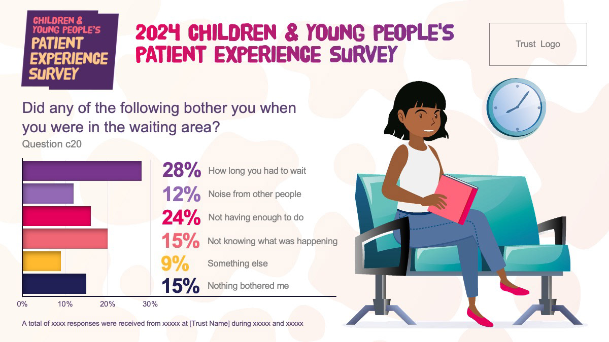
Design and illustration for a set of 8-page printed surveys tailored to children (8–11), young people (12–15), and their parents or guardians. I created the visual identity including the logo, colour palette, layouts and bespoke illustrations — working closely with researchers and survey specialists to ensure accessibility and engagement for each audience.
Design and illustration for a set of 8-page printed surveys tailored to children (8–11), young people (12–15), and their parents or guardians. I created the visual identity including the logo, colour palette, layouts and bespoke illustrations — working closely with researchers and survey specialists to ensure accessibility and engagement for each audience.
Editable Survey Results Toolkit (PowerPoint)
To support the 2025 survey results launch, I designed an editable PowerPoint file for NHS trusts to input and visualise their individual results. The toolkit uses branded charts, illustrations, and templates to help communicate key data clearly and consistently across the NHS. Also included: poster to encourage participation, plus translated survey materials in 10 languages.
To support the 2025 survey results launch, I designed an editable PowerPoint file for NHS trusts to input and visualise their individual results. The toolkit uses branded charts, illustrations, and templates to help communicate key data clearly and consistently across the NHS. Also included: poster to encourage participation, plus translated survey materials in 10 languages.
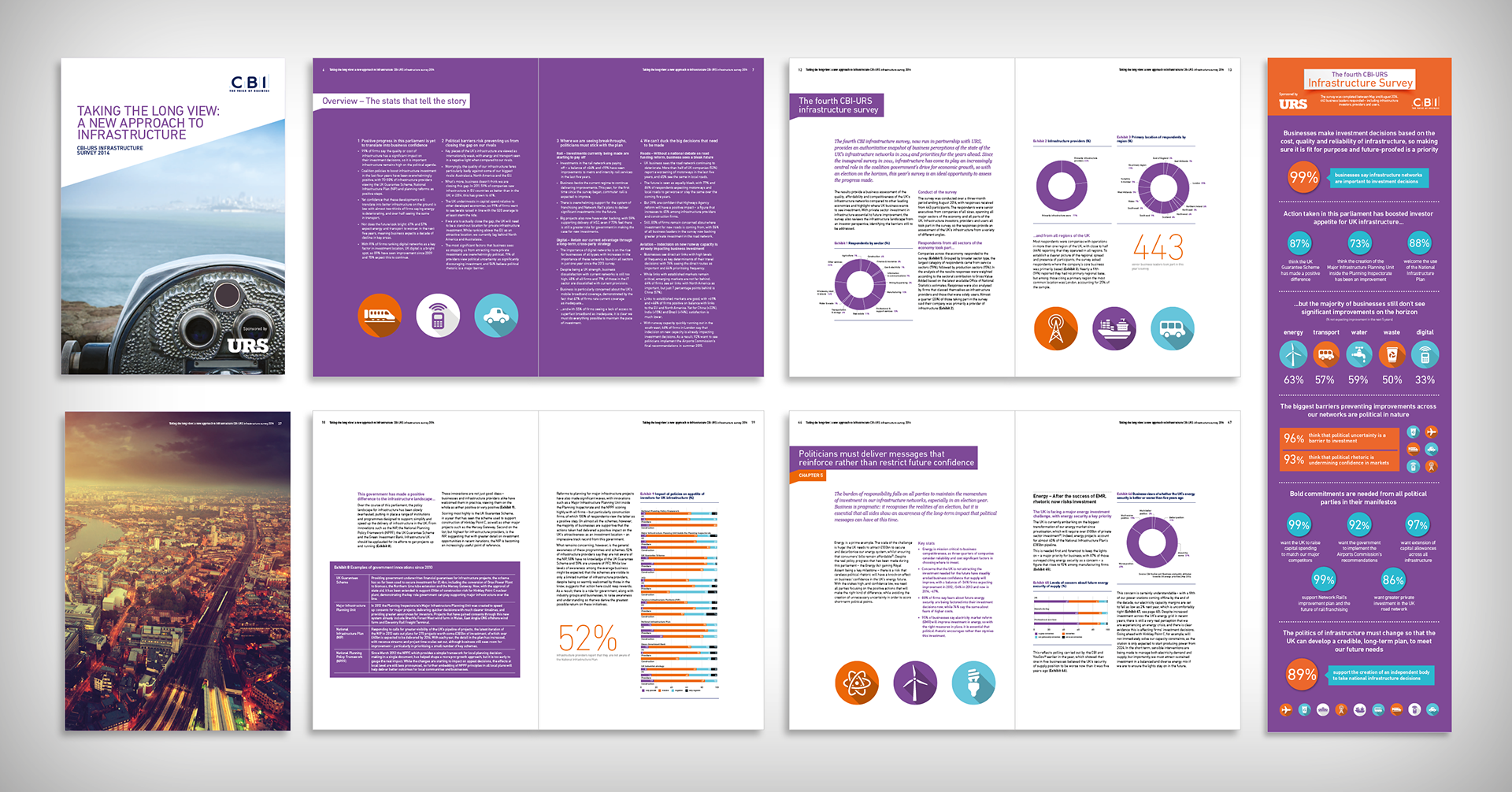
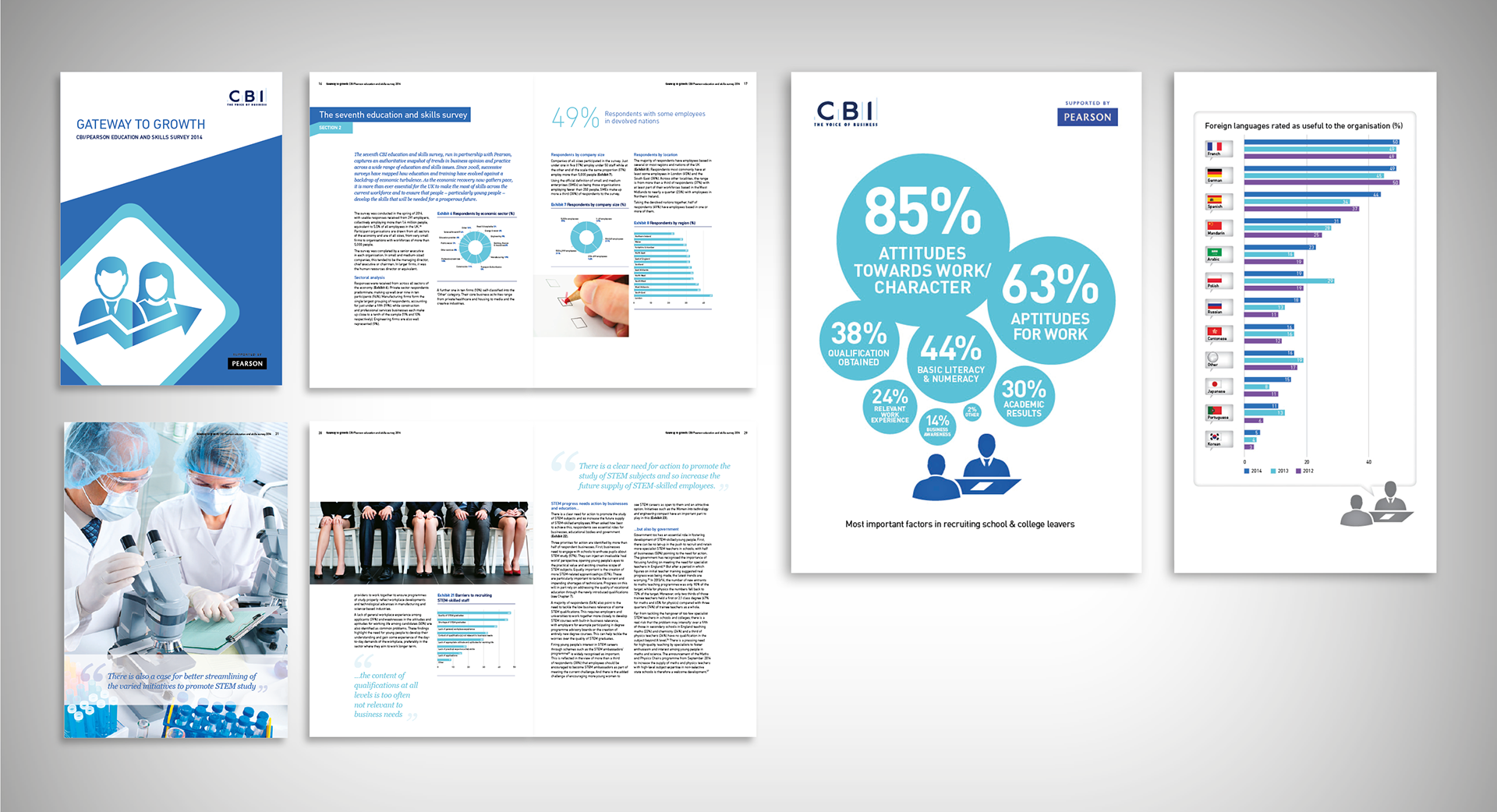
A series of data-led publications I designed for the Confederation of British Industry, including a 60-page infrastructure report and a 76-page education report, plus several standalone infographics.
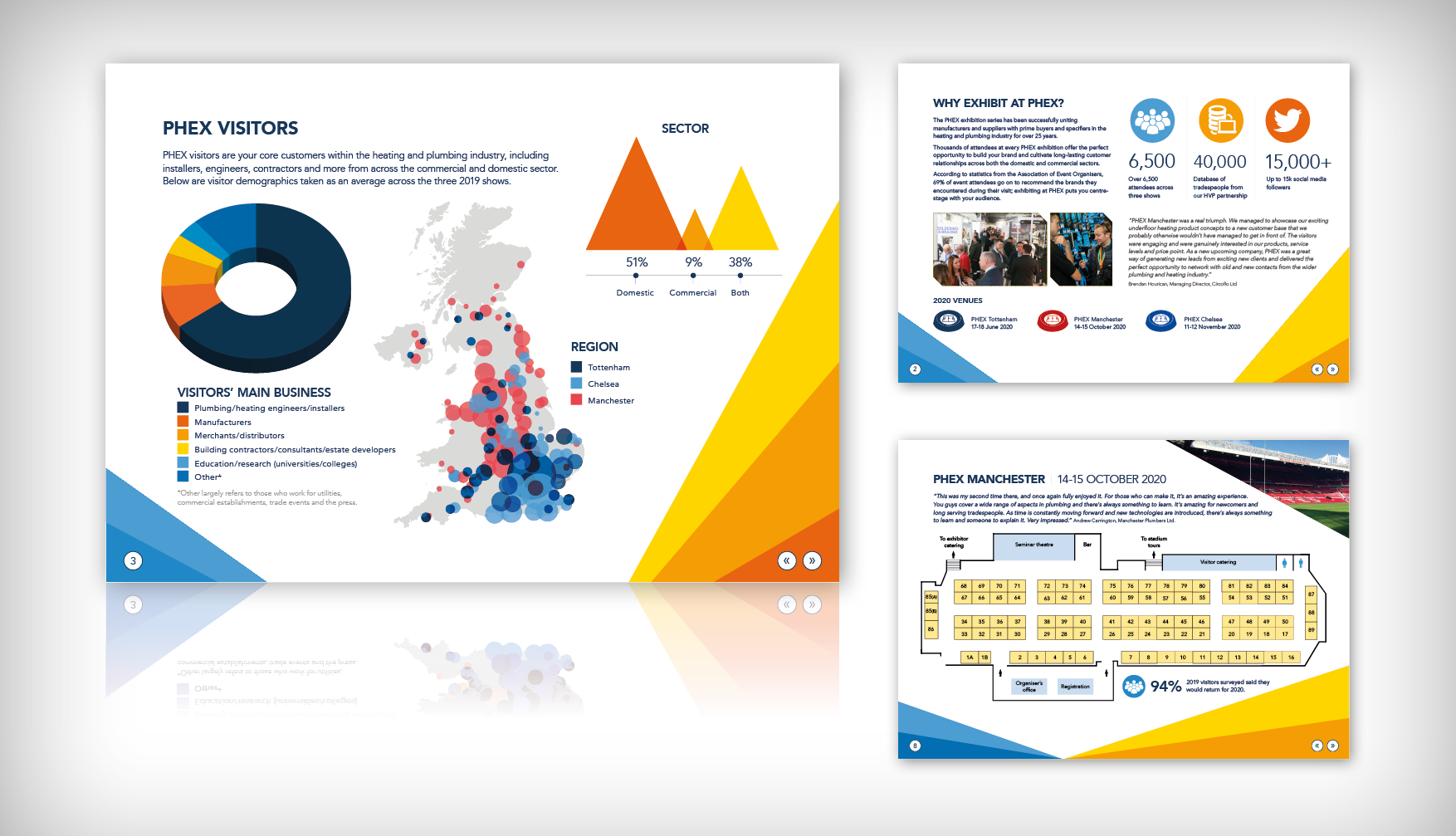
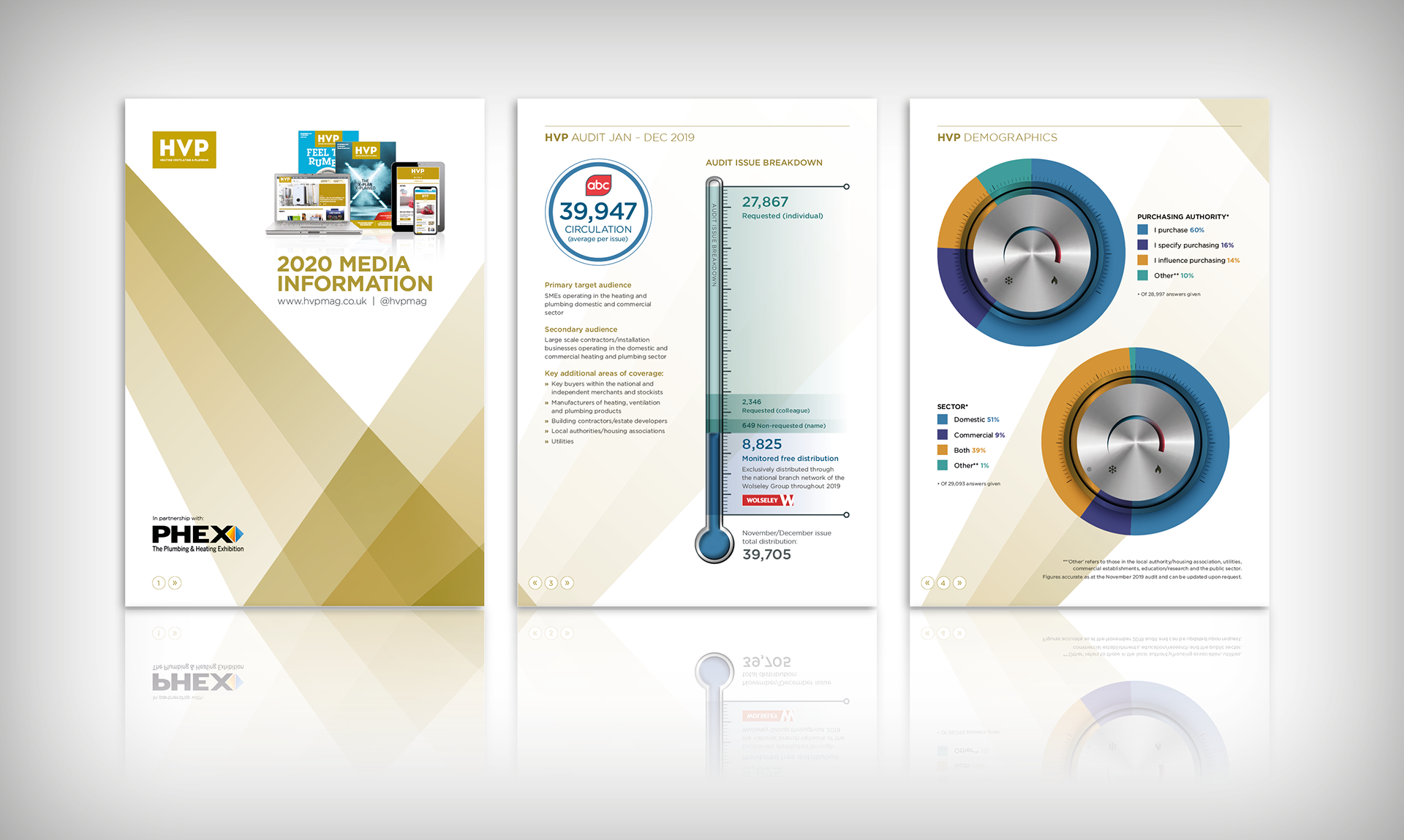
PHEX is a series of three annual exhibiton events as part of the HVP (Heating, Ventilation, Plumbing) magazine suite, showcasing the latest industry innovations and bringing together the plumbing and heating trades. I created infographics to show the marketing demographics data in a stylish visual way by picking up on the colours and styles from ther PHEX logo.
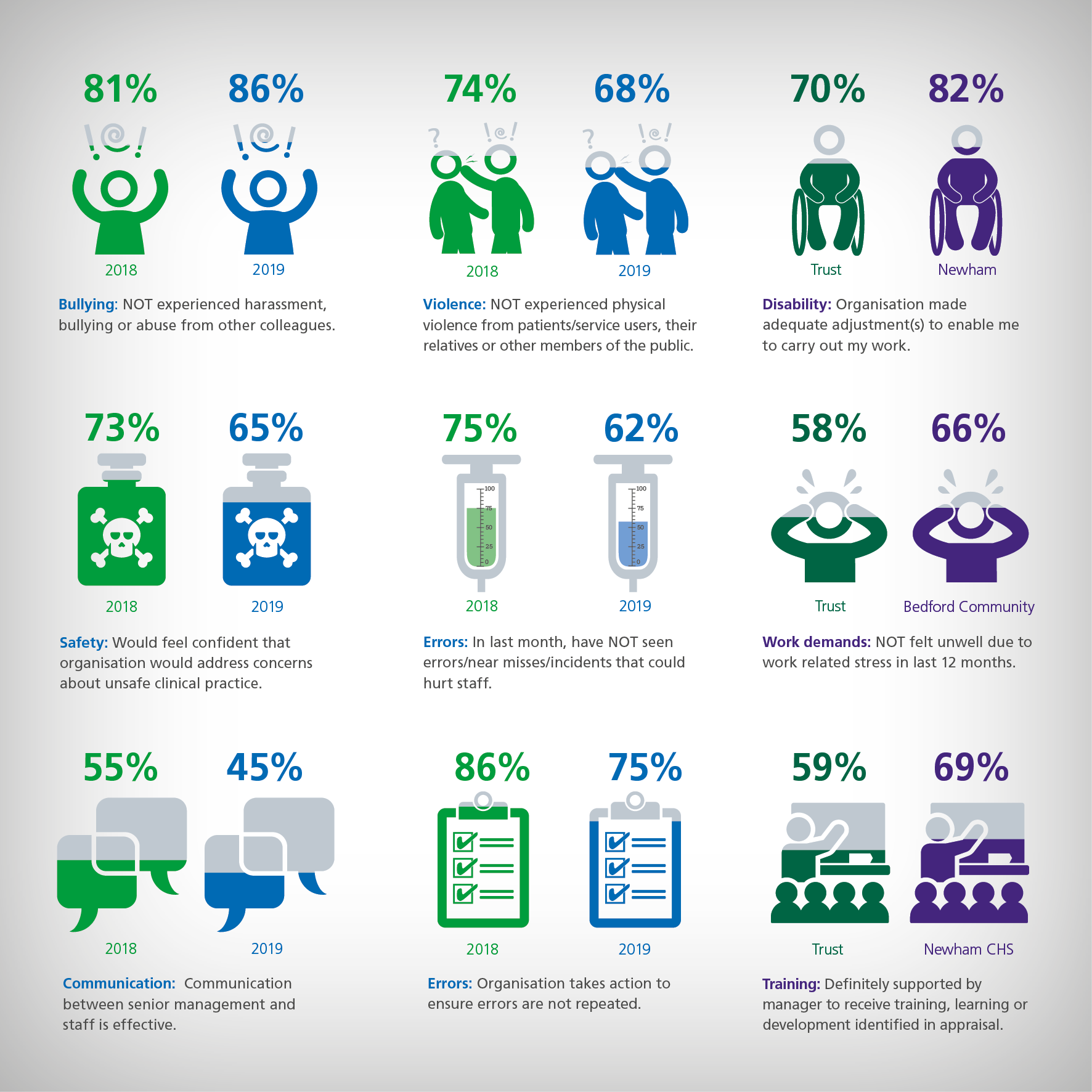
Sample NHS infographics taken from around 50 created to illustrate the results of the 2019 NHS Staff Survey in the posters below.
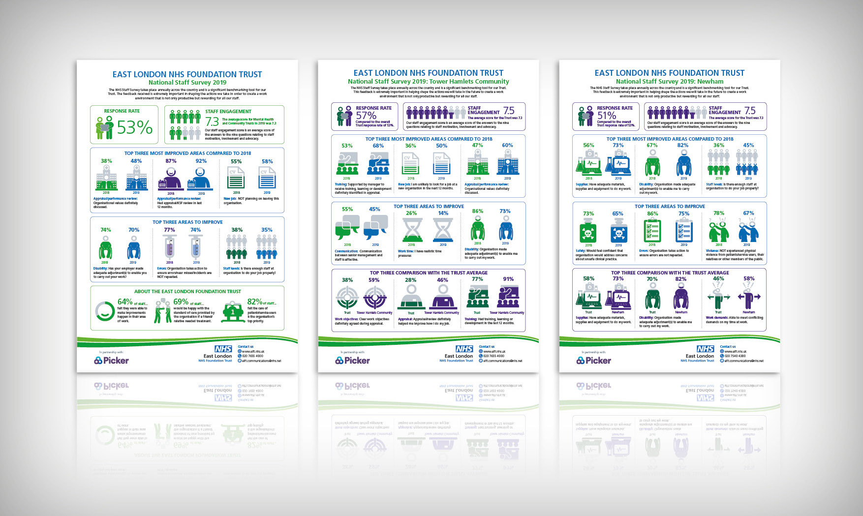
NHS infographics. Designed series of 10 infographics covering the staff survey results from the East London NHS Trust and 9 regional departments and comparisons with previous year and the trust as a whole. Designed using NHS fonts, colours and styles.
NHS Forward Look: Healthcare in Science template designs